Part 2 – The Best Features in Nicepage
Welcome to the Digital Chowder blog! It is part two of my guide to all of Nice Page’s most impressive features.
I talked about the Nicepage subscription plans and desktop app in the first video. The app is available for both Windows and Mac. The app allows you to do your design work offline on your computer and do as much as you want online. Just an excellent feature that I have not seen with any other web builder in part two.
In this video, we’ll talk about some of the design features of Nice Page that I like. This article will not be a how-to but will highlight features I like about Nicepage.

Nicepage App Dashboard:
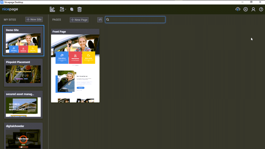
So here we are at the dashboard for the Nice Page app. I use the Windows version. You can see on the left side a list of the websites I am working with on Nicepage. I will select this site I set up as a demo site. So click on it, and we go to the front page of the website design.
Simple Format:
From here, we will talk about the simple Nicepage design format. With some builders, I need clarification on the format and help to know what to do. Also, with some builders, I feel locked into a structure that only sometimes works best for what I want to do. But Nicepage is different.
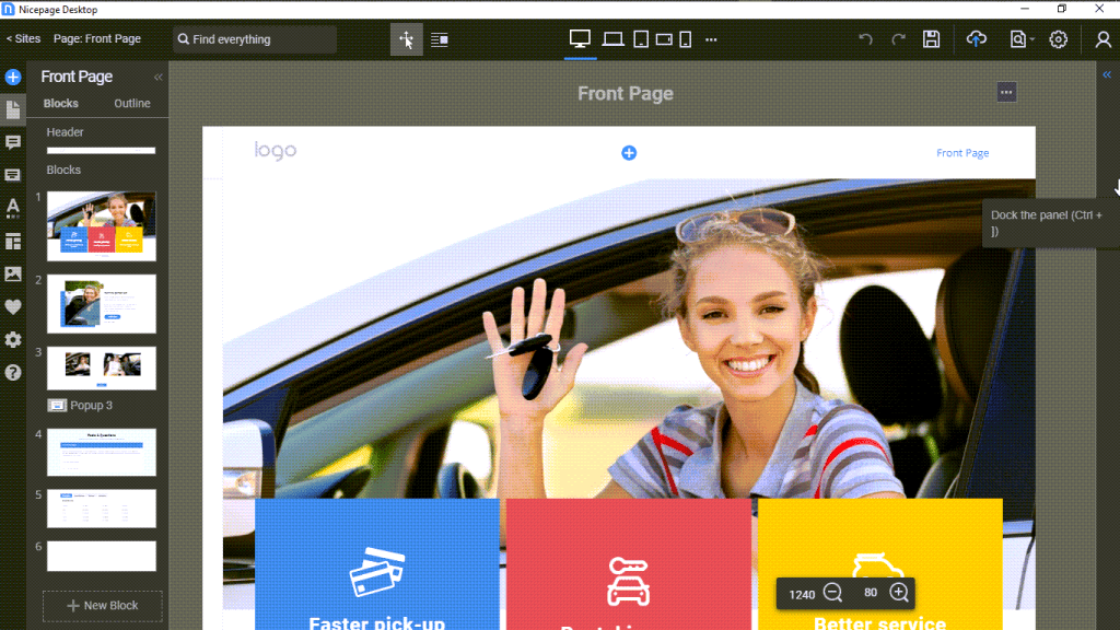
Websites these days are being built using blocks of content. And that is the case with Nicepage. You can see two blocks in this design in the image above, in addition to the header and footer.
Adding and Designing A Block:
Adding a block is a simple matter of clicking on the add block link and then choosing a design template from the library or adding elements of my choice for a preferred design.
We can see in this first block that an image is in the block as an independent element. Behind it is another separate element called a shape. To the right is a list element comprised of three items called cells.
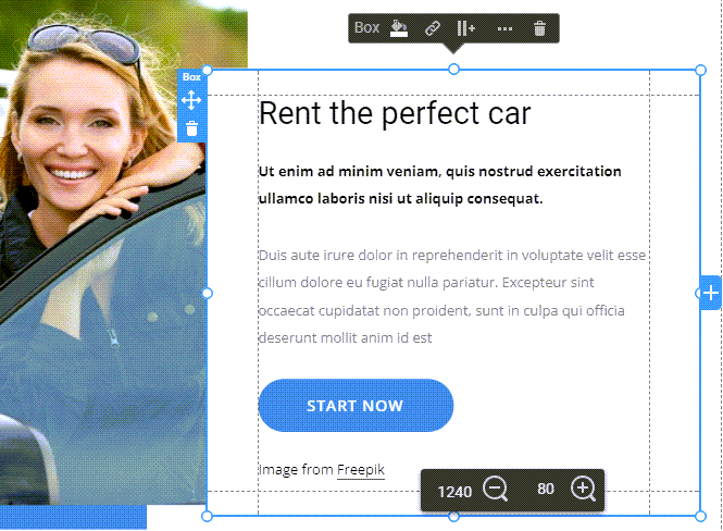
On the right is a box element. And within the box are a heading, text, and a button. And all of these are in the box. The box ties these elements together. The components within the box move with it, going where it goes. This functionality is essential for a responsive website. We are working within a desktop view, but we also want these elements to remain aligned in a phone view.
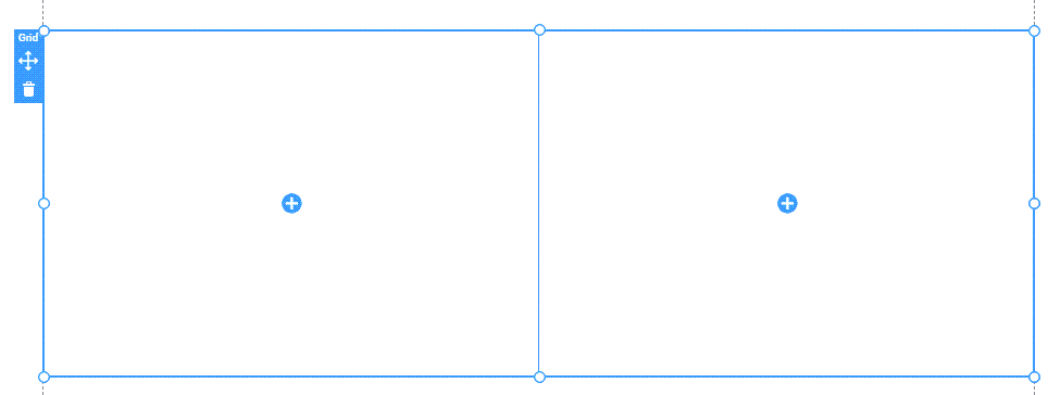
Another feature that helps to tie elements together for a responsive website is the grid. We can use 2, 3, or more cells in a grid. These cells can be independent of each other or can duplicate one another.

And here is what the grid looks like with images in desktop view.
And here is what the grid looks like with images in mobile view.

Modal:
Next, we will look at the modal. I am still looking for the modal in other builders, but it is a feature I like to use. It is one of several ways to offer more information but allows the viewer to choose whether to view it. This feature helps keep a more straightforward and cleaner page rather than cramming in information viewers may want to avoid seeing. By so doing, we can prevent losing visitors who become impatient wading through content they don’t want to get to the content they do want.
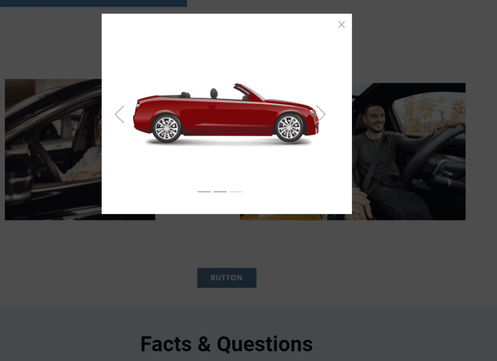
Here is what a modal might look like, but view the video below to demonstrate how it functions.
Three choices are available for launching a modal:
- Button: Launch the modal by clicking a button.
- Timer: Schedule the modal to pop up a certain number of seconds after the page opens.
- Exit: Set the modal to pop up when the visitor intends to exit the page.
Modal Plus Slider:
A modal will allow the use of any element. I like to use the slider in modals. I suggest using an image linked to a modal so the viewer can click the image and have a slide show pop-up of other related images.
Animation:
Another neat feature of Nicepage is animation. You will need to view the video to see this in action. Two blocks in the sample web page utilize animation, activated by scrolling. As the block emerges on the screen, the animation is triggered. Scrolling triggers the main image in the block shown below to zoom in. Each cell in the grid also uses zoom animation.
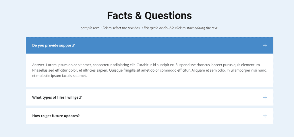
Accordion:
The next feature to highlight is the accordion. If you are unsure what the accordion feature is, you may have seen one without realizing it was an accordion. The modal is often used for FAQs, though that is only one use for them. Shown below is a FAQ accordion.
Reordering Blocks:
Web page blocks serve as units of related content. As such, blocks can serve as visual highlights of their content by using different backgrounds and other graphic design features. An excellent quality of Nicpage is the ease with which you can reorder blocks. Without moving individual elements on the page, you merely need to click an up or down arrow on the block to reorder it above or below the surrounding blocks. Moving a block can amount to significant page editing with the click of an arrow.
Additionally, there may be a block with content that is temporarily unwanted. Will you delete that block you have spent time designing? After all, you will eventually want to include it on the page again. No problem. Hide the block so it does not appear publicly.